Productivity made rest feel like failure
Reframing work-life balance from time to energy
Company: Personal
Year: 2021
Role: Product Designer
The problem
I kept working longer hours and getting less done. I knew I needed breaks. I wasn't taking them — and neither was anyone else I talked to.
People were already using Pomo Focus, Forest, Apple Calendar. The tools weren't the problem. So what was?
User interview round 1
The first to understand the problem space. Do my participants take break time? How do they manage their break time? How do they feel about it?
Taking a break already felt like failure. Participants couldn't stick to timers or schedules, so rest became something to feel guilty about. They were using the apps — and working longer hours around them anyway.
The pattern across every interview pointed to the same thing: people weren't failing at time management. They were exhausted. Time is fixed. Energy isn't. That reframe changed what I was designing for.
User interview round 2
Energy management became the problem space. But how might people actually manage their energy?
We can't track everything that affects how we feel — but we can track three essential factors: sleep, physical activity, and heart rate. The second round focused on how people were already using wearables to do that: what devices they owned, what screens they found useful, and where the frustrations were.
What came back:
Not more data. Data that means something.
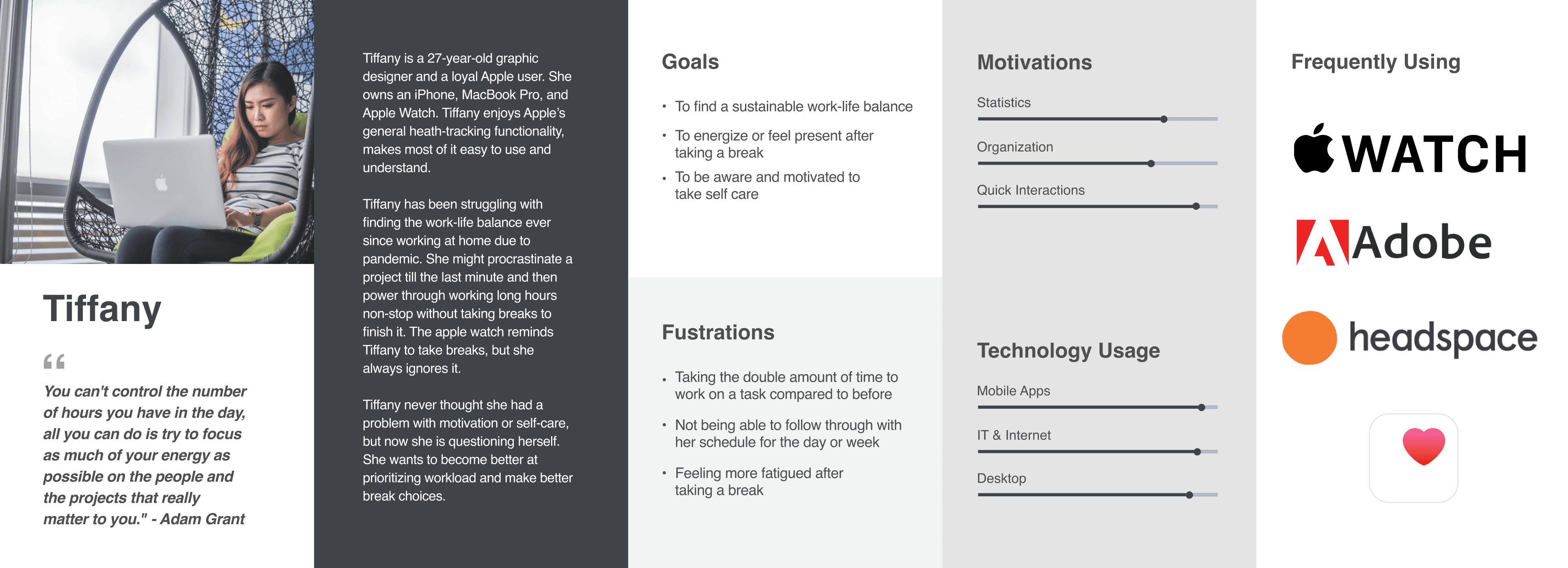
Persona
I organized my research into a persona to define the ideal user and prioritize features.
Why Apple Watch?
The watch is worn. It's personal. It sees you before you see it. If Aware is going to nudge behavior passively, that's the right surface for it — and one I hadn't seen many designers explore.
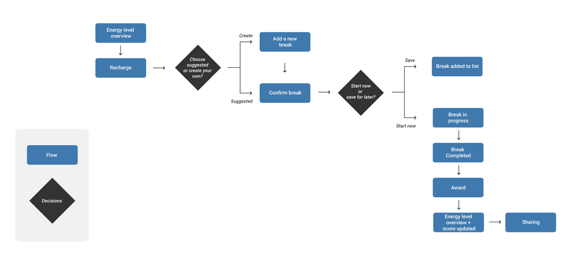
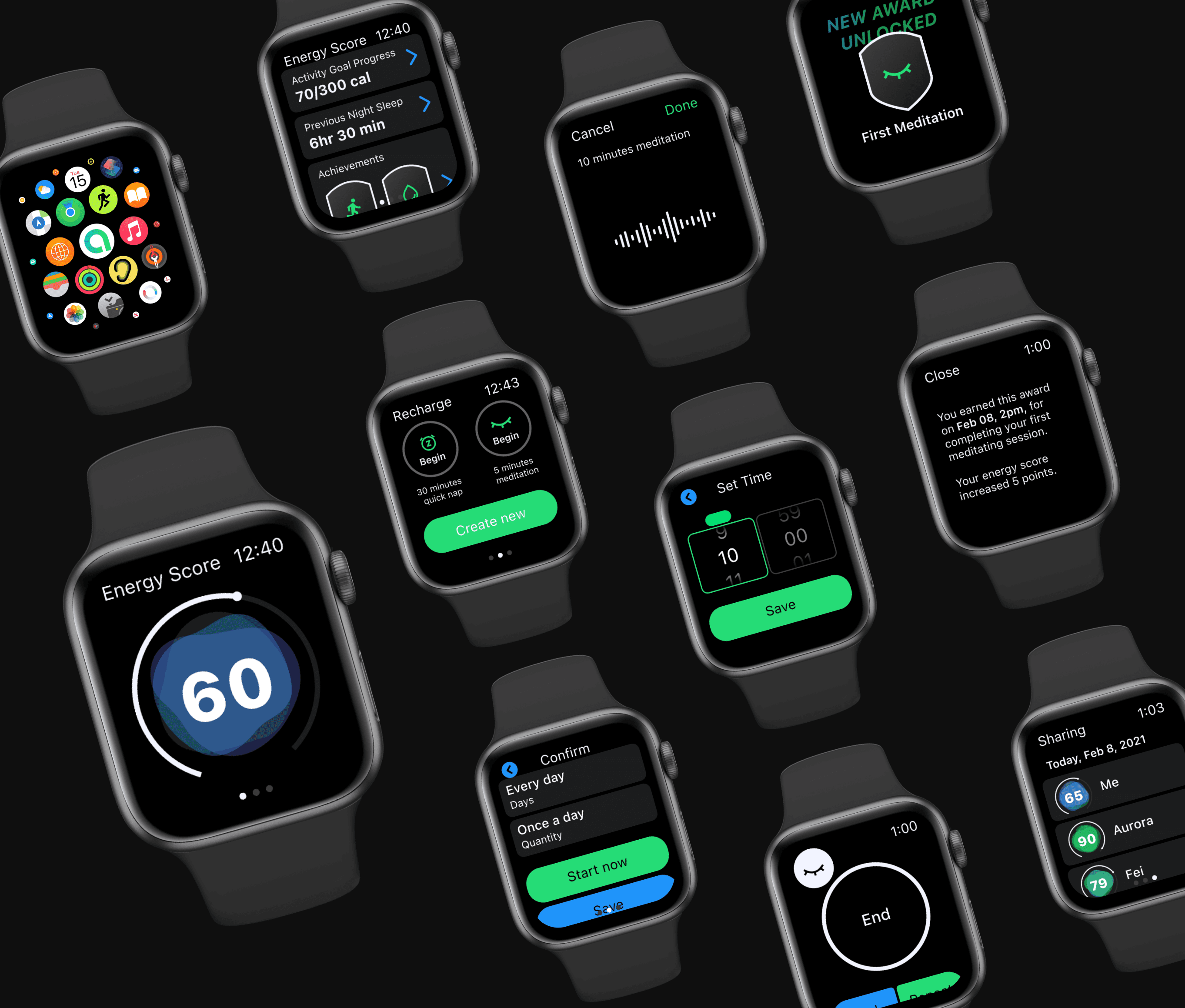
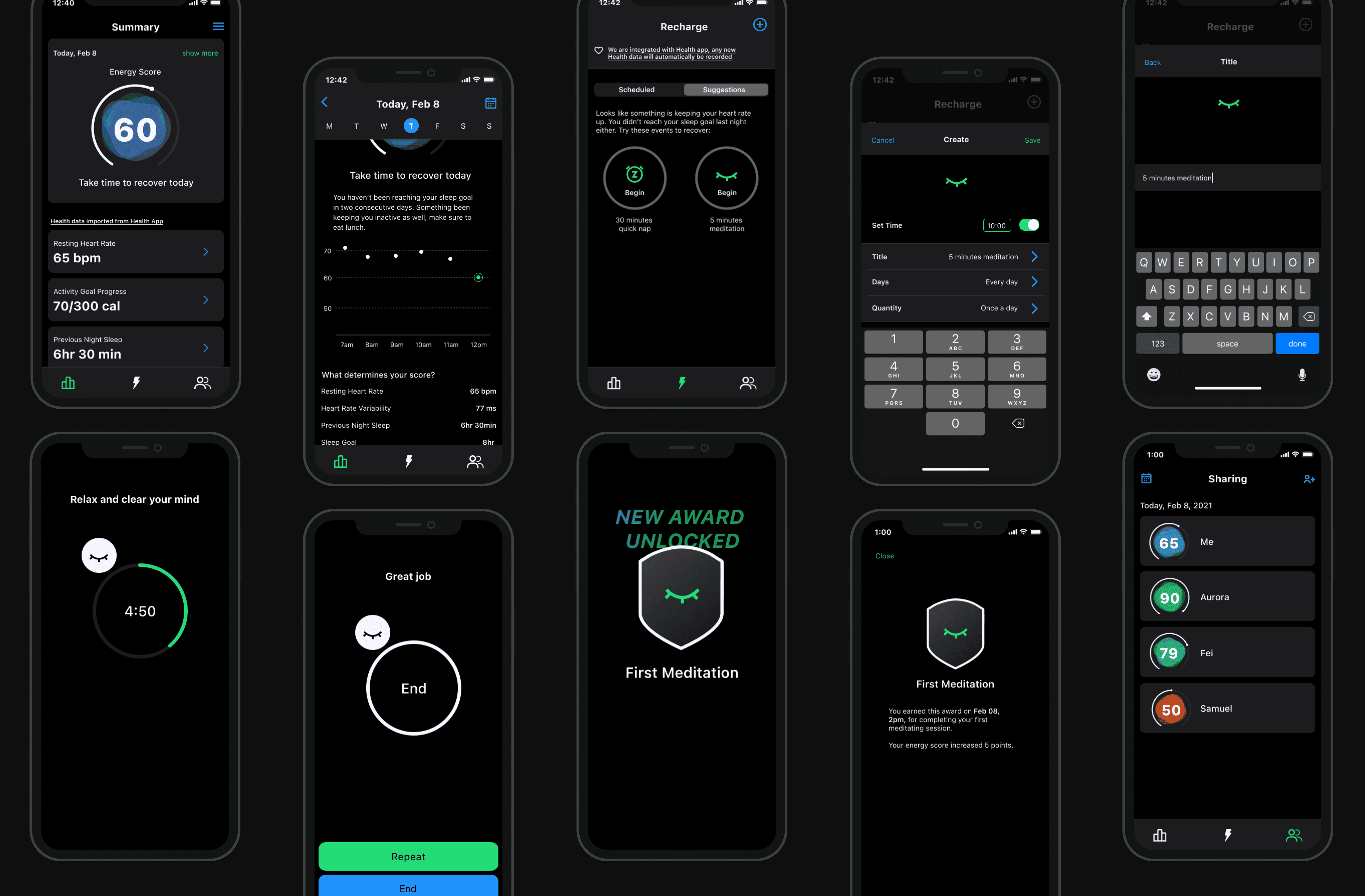
userflow
Designing for watchOS means quick, convenient interactions — every tap has to count. The flow is built around one core behavior: take a break, complete it, get rewarded. Suggested breaks reduce friction for users who don't want to decide. The award and updated energy score close the loop and make the behavior worth repeating.
usability
I went through several rounds of iteration to find the right visual for energy — something that would encourage users to take a break. A full ring implied completion. A half circle meter was closer, but still didn't capture how energy fluctuates across a day. I landed on a battery concept, which I took into usability testing.
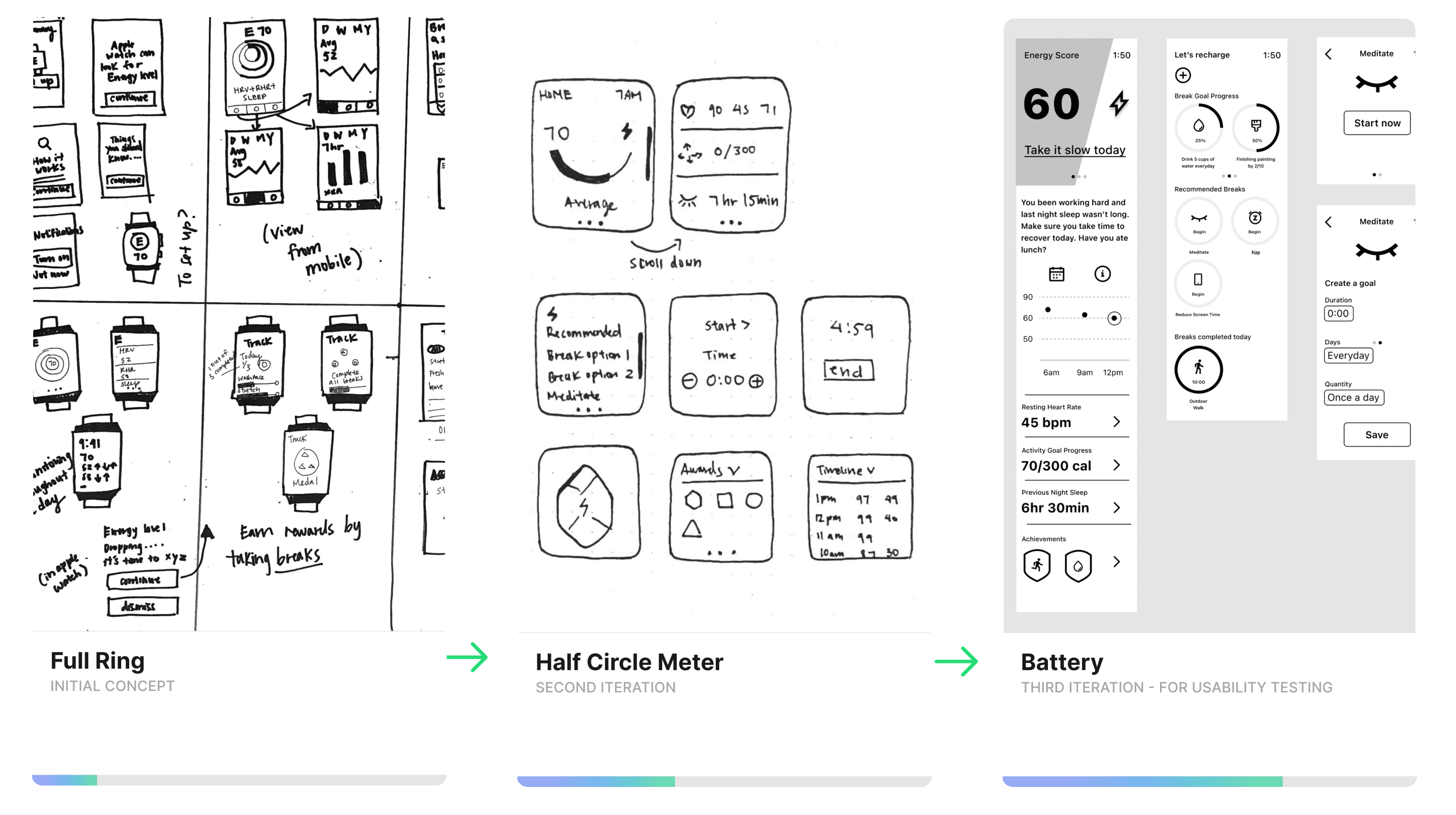
I conducted a moderated usability study through Zoom and gave my testers a few tasks throughout the user flow to accomplish the main scenario: take a break to replenish energy and clear your mind.
The battery didn't land. Participants didn't recognize the concept and questioned whether 60 was good or bad. A gauge meter solved it — intuitive enough to read at a glance, fluid enough to show energy rising and falling.

final design
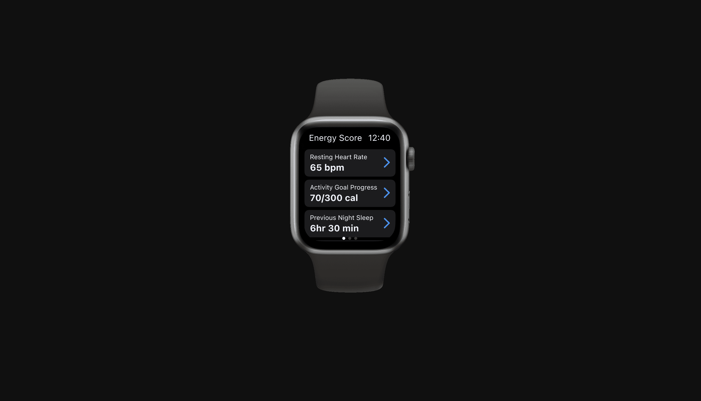
At a glance, users can get an overview of the day's energy — recognizing and understanding why they feel a certain way when they feel it. The energy graph shows dips and peaks across the day, not to optimize every hour, but to make patterns visible.
Three passive inputs, already tracked by Apple Health: resting heart rate, activity goal progress, and sleep duration. No new habits. No manual logging. The score surfaces in the mobile app with more detail for those who want it.
Building a habit is easier to sustain when it's social. The sharing layer lets you compete with friends on energy — making good habits something you build together.
Results
I conducted a remote unmoderated task-based usability study with 19 participants through Maze. Participants were given a description of the app concept and walked through benchmark tasks one by one.
Aware earned an 85 usability score across four key indicators: success rate, bounce, duration, and misclicks.
89%
found the tasks easy to complete
83%
felt motivated to take breaks
89%
would recommend it
The problem
I kept working longer hours and getting less done. I knew I needed breaks. I wasn't taking them — and neither was anyone else I talked to.
People were already using Pomo Focus, Forest, Apple Calendar. The tools weren't the problem. So what was?
User interview round 1
The first to understand the problem space. Do my participants take break time? How do they manage their break time? How do they feel about it?
Taking a break already felt like failure. Participants couldn't stick to timers or schedules, so rest became something to feel guilty about. They were using the apps — and working longer hours around them anyway.
The pattern across every interview pointed to the same thing: people weren't failing at time management. They were exhausted. Time is fixed. Energy isn't. That reframe changed what I was designing for.
User interview round 2
Energy management became the problem space. But how might people actually manage their energy?
We can't track everything that affects how we feel — but we can track three essential factors: sleep, physical activity, and heart rate. The second round focused on how people were already using wearables to do that: what devices they owned, what screens they found useful, and where the frustrations were.
What came back:
Not more data. Data that means something.
Persona
I organized my research into a persona to define the ideal user and prioritize features.
Why Apple Watch?
The watch is worn. It's personal. It sees you before you see it. If Aware is going to nudge behavior passively, that's the right surface for it — and one I hadn't seen many designers explore.
userflow
Designing for watchOS means quick, convenient interactions — every tap has to count. The flow is built around one core behavior: take a break, complete it, get rewarded. Suggested breaks reduce friction for users who don't want to decide. The award and updated energy score close the loop and make the behavior worth repeating.
usability
I went through several rounds of iteration to find the right visual for energy — something that would encourage users to take a break. A full ring implied completion. A half circle meter was closer, but still didn't capture how energy fluctuates across a day. I landed on a battery concept, which I took into usability testing.
I conducted a moderated usability study through Zoom and gave my testers a few tasks throughout the user flow to accomplish the main scenario: take a break to replenish energy and clear your mind.
The battery didn't land. Participants didn't recognize the concept and questioned whether 60 was good or bad. A gauge meter solved it — intuitive enough to read at a glance, fluid enough to show energy rising and falling.
final design
At a glance, users can get an overview of the day's energy — recognizing and understanding why they feel a certain way when they feel it. The energy graph shows dips and peaks across the day, not to optimize every hour, but to make patterns visible.
Three passive inputs, already tracked by Apple Health: resting heart rate, activity goal progress, and sleep duration. No new habits. No manual logging. The score surfaces in the mobile app with more detail for those who want it.
Building a habit is easier to sustain when it's social. The sharing layer lets you compete with friends on energy — making good habits something you build together.
Results
I conducted a remote unmoderated task-based usability study with 19 participants through Maze. Participants were given a description of the app concept and walked through benchmark tasks one by one.
Aware earned an 85 usability score across four key indicators: success rate, bounce, duration, and misclicks.
89%
found the tasks easy to complete
83%
felt motivated to take breaks
89%
would recommend it